US vs. UK Showdown: Slide by Jill Hathaway
Hey Remarkable Readers!
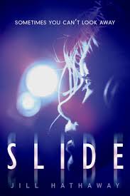
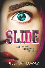
I thought it might be fun to do a UK vs. US cover post once in a while! The contrast between the covers of Slide by Jill Hathaway always stands out to me! I really like the US cover because of the dark colors. I like the blend of colors in the background and they almost look like police lights to me, which fits into the storyline! I like the UK cover too because it's illustrated and colorful. I think I like the US better, though.
 |
| US cover |
 |
| UK cover |
Vee Bell is certain of one irrefutable truth—her sister’s friend Sophie didn’t kill herself. She was murdered.
Vee knows this because she was there. Everyone believes Vee is narcoleptic, but she doesn’t actually fall asleep during these episodes: When she passes out, she slides into somebody else’s mind and experiences the world through that person’s eyes. She’s slid into her sister as she cheated on a math test, into a teacher sneaking a drink before class. She learned the worst about a supposed “friend” when she slid into her during a school dance. But nothing could have prepared Vee for what happens one October night when she slides into the mind of someone holding a bloody knife, standing over Sophie’s slashed body.
Vee desperately wishes she could share her secret, but who would believe her? It sounds so crazy that she can’t bring herself to tell her best friend, Rollins, let alone the police. Even if she could confide in Rollins, he has been acting off lately, more distant, especially now that she’s been spending more time with Zane.
Enmeshed in a terrifying web of secrets, lies, and danger and with no one to turn to, Vee must find a way to unmask the killer before he or she strikes again.
So, which do you like better?


The US Cover makes my eyes hurt if I stare at it too long, so I like the UK cover a lot more... even though it makes me laugh at times because of how SHOCKED she looks.
ReplyDeleteYou're right! The lights in the background do kind of hurt my eyes! haha! For the UK cover, I guess I'd be pretty shocked if I saw a murder, though!
Delete-Jessie
Usually I prefer UK covers but I think I like the US cover. Also the UK cover is kind of scary. She looks way too shocked lol
ReplyDeletethe US cover looks like you should be squinting to see it correctly, but i can't get over the eyebrows in the UK cover. i think i like the US better
ReplyDeleteLove the US cover! The girl on the UK cover is scary!
ReplyDelete♥ Melissa @ Melissa's Eclectic Bookshelf
I'm a big fan of the US cover. The colors, the fact that it looks like the girl is hiding from the police...it just makes me want to read it.
ReplyDelete